


37 errors in online store baskets that interfere with conversion
This article was translated automatically. We are working over improving the translation.
Please send your questions about the article to info@intervolga.ruWhy 37?
This is a remake of the article "26 errors in the baskets of the online store." The first version appeared in 2014 and became one of the most popular articles about online shopping. We decided to improve and supplement it. Now errors 37 (!). They relate not only to the basket, but to the choice of goods, ordering and confirmation of it - most of the conversion path.
What is the article about
The main goal of any online store is the sale of goods or services. One of the main tools for making sales through the online store is, of course, a shopping cart. In the article we will try to figure out why this tool is often not an assistant, but, on the contrary, a hindrance in the “went to the site — saw — acquired” algorithm.
For those who want to find a panacea for the lack of sales through the online store in this article, we have some advice - think in a comprehensive way, do not look for the source of problems in only one place. We analyzed the baskets in online stores and reviewed the errors encountered.
I can’t say that every online store has a snowflake personality, but there are still several large groups for which some tips will ultimately bring profit, while others are not relevant. So read, taking into account the profile of your activity.
When choosing the appearance of a product card, placing buttons, developing an order algorithm, you must take into account the characteristics, tastes, demographic and other indicators of a potential buyer.
Search and selection of goods
1. There is no possibility to add a product in an empty basket
The buyer does not always share your idea of the purchase algorithm and, instead of the “Catalog”, clicks on the “Basket”. And what will he do if he does not understand how to make purchases from there?
2. Congestion with unnecessary information about the product inside the basket
The item number, detailed description, etc., are often not needed by customers in the table with the goods in the basket - there is enough reference to the product card, where such information is stored. This advice can be viewed from different angles. For example, the product article, especially if it is long, is most likely not needed. An exception may be, for example, self-pickup, when the article must be called at the point of issue.
3. There is no way to go back to shopping from the cart
The button “return to purchases” should be at least because it encourages the user to continue shopping.
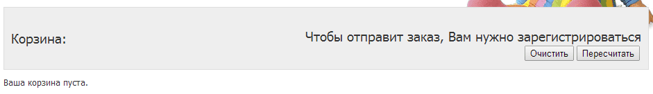
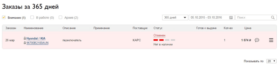
4. Misinformation or lack of information on the availability of goods
Often, users who do not want to pay for delivery or are accustomed to see the goods with their own eyes before buying, go to an online store only to find out if there is a product in which they are interested in retail stores and in what specific ones. If there is no such information on the site, and your product is not unique, the user will simply make a purchase elsewhere.
Other situation. The site has a graph informing the user about the availability of the product, but it is either not updated or standardly shows that the product is in stock. In fact, the availability of goods is checked only after the user has placed or even paid for the order.
As a result, if the user has paid for the goods that are not available, the money is returned to the user's virtual account in points, with which he can pay for any other goods. You can make it possible to return money to a card or an e-wallet user, but this situation is unlikely to force the customer to continue shopping in your online store.
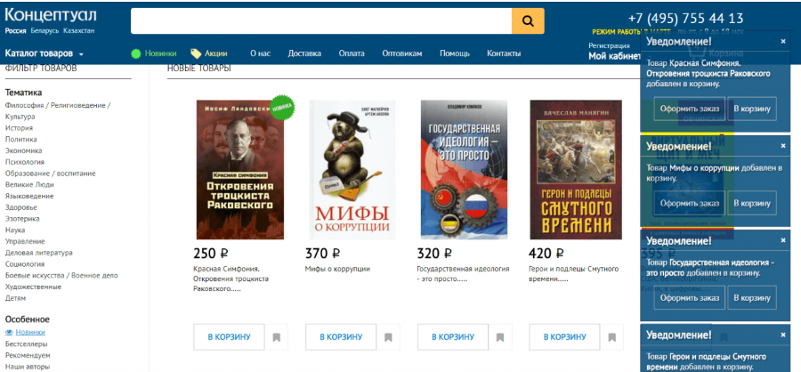
5. Too many popups
Try to limit the number of pop-ups, whatever useful information they carry. In the end, the user gets tired to close the endless alerts, about the actions taken by them or about the promotions taking place in the store, and simply leaves the site.
If you still make pop-up notifications, make sure that they do not overlap most of the screen and close themselves after 5-7 seconds, without requiring the user to perform unnecessary actions.
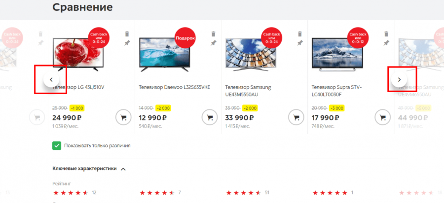
6. Inconvenient product comparison interface
Products are compared absolutely across the list of their inherent characteristics. The user has to endlessly scroll the tape up and down to compare only the characteristics of interest. In addition, when adding more than 4-5 products to the comparison, the user has to scroll not only up, down but also to the right and left, which can only be done at the top of the page.
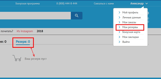
7. Several identical text links in one window lead to different pages
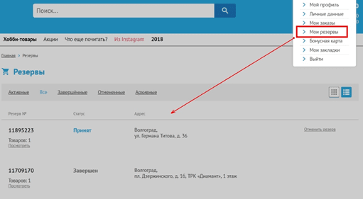
Consider this error with a specific example. The store has a service "Reserve". The user adds items of interest to his reserve, but later wants to edit or simply view the list of reserved items. In his personal account, he finds two buttons: "Reserve" and "My reserves." It is logical that by clicking on any of them the user should see the list of goods in the reserve, but in reality it is not.
When you click on only one of the links, you can see the current list of reserves. When moving to another, there are no reserves, as if the user had not reserved anything at all.
If you place several identical links on a page, make sure that they lead to identical or at least non-conflicting pages.
Add to cart
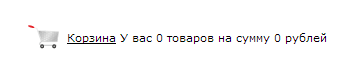
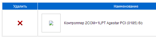
8. No cart icon
Some sites do not have a trash icon. But instead there is a phrase (word), which is a link. The user instinctively searches for his eyes with a bright, familiar to painly trash icon. He will pay more attention to the button than to the inscription.
It happens worse: until the user adds the goods to the basket, he does not see either her graphic or text image.
For example: before adding goods to the order.
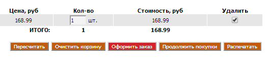
after adding:
9. Atypical place to place the basket
Instead of the usual upper-right corner, it is placed in the most secret corners of the site or not at all.
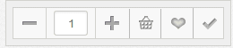
10. Incomprehensible formulation and appearance of the incentive to purchase
Instead of a button with words:
![]()
or
![]()
or
![]()
use a graphic image of the basket or an image of a box, cat, etc. It is not always obvious to the user that if he clicks on the image of the basket, he will add the goods. Especially if the picture is small or incomprehensible. Also, from the point of view of search engines, it is advisable to use a button with a commercial name (“Buy” or “To cart”).
11. You can not add items to the cart from the general list
You can add a product just by going to its card.
Basically it can be found in the shops of expensive goods and goods that require thoughtful study and input of additional parameters. This eliminates the moment of impulsive buying. Good or bad - it's up to you.
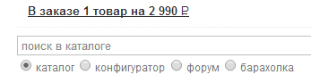
12. After clicking the “Add to cart” button there are no visible changes.
Those. the “to cart” button did not change either the color or the content after clicking on it (for example, to “in the cart”). The basket itself has not changed externally, or has changed only slightly (usually the quantity of goods in the basket and their cost usually appear). As an option - go directly to the basket, where you can go back to shopping by clicking on the appropriate link.
13. Double clicking on the “buy” button cancels the action of adding a product or increases its quantity
A user accidentally presses “Buy” 2 times or not, whether he sees that the goods have dropped out of the basket or the quantity of goods in the order has increased, or not - this function of benefit brings clearly less than harm.
14. After cleansing, the basket becomes completely empty
The basket becomes literally “cleared” - without instructions for action, conditions, etc. Clearing it (perhaps even accidentally), the user still needs instructions. He should not panic, reload the pages and look again for a way to add products to the order. Encourage him to take action!
15. Negative messages in baskets
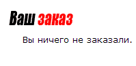
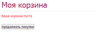
Negative messages scare buyers away. For example, “You have 0 purchases” or “You have no discount coupons”. An empty basket should only encourage action, and not tell the buyer that he does not have something.
Order Manipulations
16. You can not change the characteristics of the goods from the basket
For example: the user added a pair of shoes to the basket, but later decided to change the selected size. In order to select other characteristics of the product, he will need to remove the product and add it again, with the changed characteristics. This is not very convenient. It is necessary to give the user to change the most basic characteristics of the product (color, size) directly from the basket.
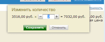
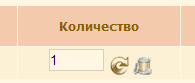
17. You can not reduce or increase the amount of goods
A person does not understand what he needs to do to change the quantity of goods. There are cases when this action is not provided for at all. You must use the typical icons + and - or arrows "↑ up" and "↓ down".
18. The cart has no link to the item card
The buyer must return to the store and look for the product again to view product information.
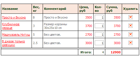
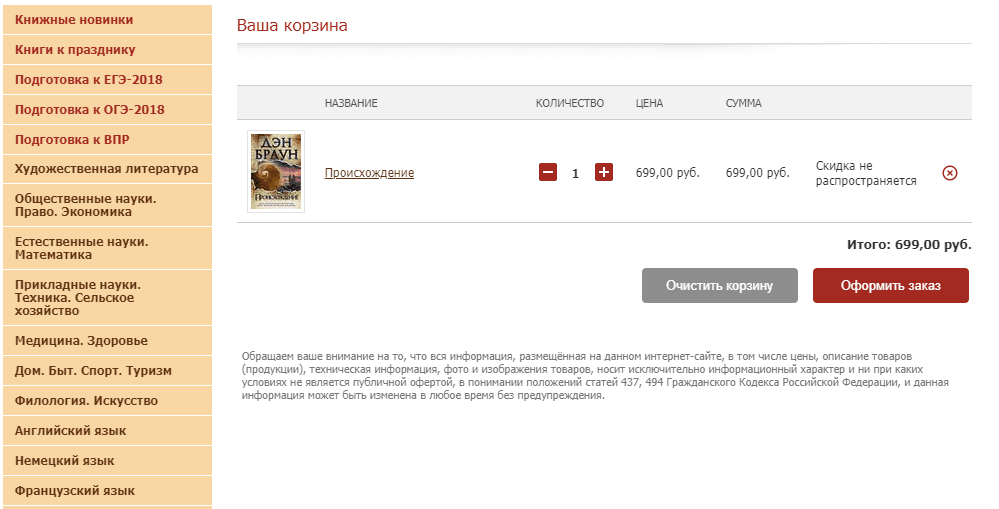
19. Items in the basket without a photo
Just a list of obscure names, their quantity and cost. In many cases, especially when it comes to an online store, the user makes a purchase decision, focusing on the product photo. And when the buyer has to make the final decision on the purchase, one of the important elements completely disappears out of sight. And, perhaps, out of mind too. Seeing in front of him several deferred sofas with names like “Wind blowing”, “Spring meadows” and “Lilies of the valley in bloom”, the user hardly remembers how they look. So how can he decide - which one to leave, and which ones to remove?
20. Close location of the “Empty Trash” button to other buttons
The dangerous location of the "Clear" button will help the user to accidentally erase the results of their labors to add products. What is possible would entail closing the tab with your online store in the browser annoyed customer.
21. Selecting the removal of goods from the rest of the actions
There should not be too bright a badge with a cross and other motives to remove goods.
Products should shout that they can add, increase their number, but only whisper that they can be removed.
22. The "Delete product" button is missing, or the deletion process is confusing and time consuming
The removal process should be as simple as possible and not require extra actions from the user. A bad example: to remove goods you need to tick them, and at the bottom click “Clear” and “Recount”.
The most ideal option is a cross or the word "delete".
23. There is no possibility to return the deleted item
If the user deletes the product by accident and wants to return it to the order, he has to look again for the product card in the store. In this case, most users will simply make an order without a deleted item, especially if the item was added impulsively.
Checkout
24. Too long and complicated order process
We would like to separately draw your attention not only to the basket itself, but also to the whole order process as a whole, since the cart is an integral part of the ordering algorithm and sometimes its starting point.
In one of the sports shops, from the moment the “buy” button is pressed to the message that his order has been sent, the user performs 11 (!) Steps. Even if you do not have any flaws in the design of buttons, etc., the commission of an order can be compared with the conquest of Everest, halfway to the top you can lose a lot of your customers.
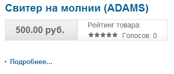
For example, in the children's clothing store, clicking "More",
and then "Buy" the following message appears:
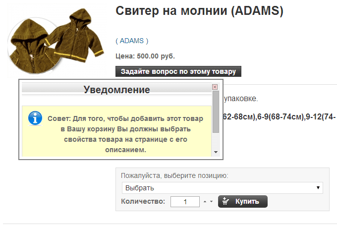
I spent 20 minutes trying to figure out where I need to select properties. Dimensions without references and the ability to choose, just listing. I did not find it.
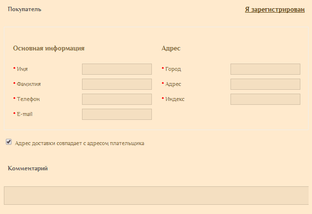
25. Too many required fields when ordering
Zip code, pet name and other fields that are in the user's path to get to the desired purchase. Remember, some are afraid to enter data about themselves, some do not remember half of what the order form requires. Make only required fields.
For example, for a bedding store a bit too much mandatory information about a customer:
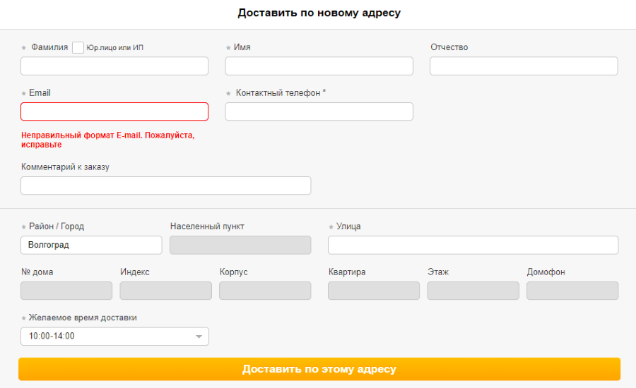
26. Many fields, even if not mandatory
Often ordering or registration forms contain a frightening number of fields. Not every user immediately pays attention to which fields are required and which ones are not. If a form containing 10 or more fields appears in front of it, then there is a desire to close the site and place an order somewhere else.
In the registration form and ordering is to add only the most necessary fields, and "optional" to postpone until such time as they become necessary. For example, the user began to place an order, but has not yet chosen the delivery method. In this case, you should not ask him in advance to fill in the fields, the information from which is needed for delivery by mail. Perhaps delivery by mail to the user and not needed.
27. Orders can be made only by registered users
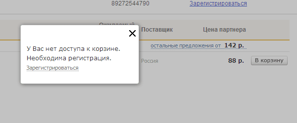
And also, to postpone the goods, you need to register:
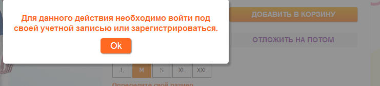
How many people like to register on all sites where they go? The real user e-mail received is good, a lazy or suspicious customer left is bad. The right choice will help you to make only a detailed analysis of the target audience and the structure of your business.
28. Registered user data is not automatically inserted into the order form
Often, a registered user must fill in the information fields that he filled out during registration during the ordering process. This significantly reduces the speed and convenience of placing an order. By setting up auto-completion of some information fields, you will save the user's time and get another loyal buyer.
29. There is no information on payment methods and delivery / return / exchange of goods (or information is difficult to access)
Any information about the product, methods of return or exchange, payment methods must be written and framed in such a way that it would be understandable even to a novice user. And the user should not look for this information. It is best to place links to this information in the basket, even if it is empty. This will help avoid unpleasant situations for the user. For example, a person understands that he cannot pay for a purchase with a card, only having reached the last stage of the ordering process, but he has no cash. As a result, he does not just buy the product, but is unlikely to return to your site.
30. Complex recalculation order manipulations
Unnecessary steps like pressing “save changes” and “recalculate order” buttons are not needed.
The one-click checkout system is very attractive for users who do not want to waste time entering a huge amount of data.
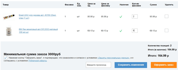
31. Order amount is not automatically recalculated when the quantity of goods changes.
In a situation when the user adds goods to the order, and later either increases the quantity of one or another product, or deletes certain items, the total amount of the order is not recalculated. As a result, the user cannot find out the final cost of the order until he refreshes the page or goes to pay for the order.
32. Unclear icons accompanying the order process
Instead of a cross, you can find an image of a trash can, a dustpan with a broom, etc. Instead of a plus, intricate arrows, etc. can be used.
The simpler and more obvious the icon, the better.
33. Non-one-time operation of all services
Such an error most often occurs when there are operators in the online store that clarify the fact of placing an order.
Example: you place an order for sushi delivery. After a few minutes, the operator’s phone number will be sent to your specified phone number, which will specify the items ordered and the delivery address.
Since the user can place an order at any time of the day or night, operators should work around the clock. Otherwise, the user who placed the order, but did not receive a call from the operator, the question arises: “Was the order issued at all or did I do something wrong?”
Additional sale processes
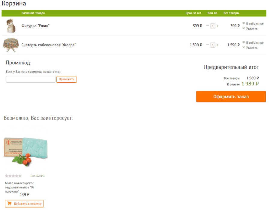
34. User is not offered related or similar products.
Related products allow you to increase sales of almost any online store without much effort or discounts. If the user is shown the product that is an integral part or a good addition to the product being ordered, then it is likely that he will buy it. Statistics show that at least 50% of buyers agree to purchase some useful detail for the newly acquired goods.
35. Related or similar products are selected incorrectly
Related products should always be the same subject with the product in the order or supplement it. For example, if a user has added a garden figurine and a tablecloth to a basket, then you can offer him popular products from the categories “For the Kitchen” or “For the Garden”, but not psoriasis soap.
36. The button "Postpone" hides the product
The “Postpone product” button hides the product so far that it cannot be found later.
If you have already entered this system, then do not forget it is clear for the user to issue. After all, there is a high probability that pending goods are converted into real sales.
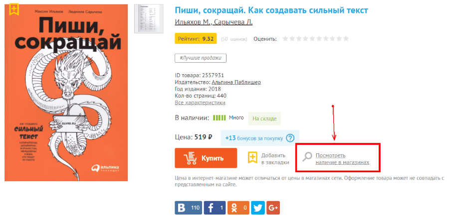
37. “Postpone” button cannot be found
It is clear that the "Postpone" button should not be intrusive, do not drag attention from the "Buy" button, but the user should not make a lot of effort to find it.
Example: the service “postpone” is, but in order to postpone the goods, you must first go to the page “View availability in stores”. But there he also will not see the button to be put off until he chooses one of the shops on the map.
Findings
Not always technical innovations and unusual design help to emphasize the individuality of the online store. Most often, atypical elements put the user to a standstill and do not make a grand impression.
Creating a cart and thinking through the process of ordering, you must represent yourself at the place of the buyer. Calculating every step of the user when placing an order, you need to remember that the client does not want to spend a lot of time on it. If you are not sure whether to add a lot of steps on the way to a purchase, it is better not to.
Think of a different way to confirm the order than filling in endless forms and pressing dozens of buttons on the client. For example, a call back to the user when entering only the basic data in the order form. If the choice is between what is simpler and between what is sophisticated - make a choice in favor of simplicity.
Pay attention to online stores of the same industry: try to make a purchase in several of them, analyze their usability and functionality, draw conclusions. Ideally, the user should instinctively navigate your online store, even if he first visited it. The location of the basket, its contents, the purchase process, the return from the basket, instructions, etc. - all this should be as predictable as possible for your customers.
This article was translated automatically. We are working over improving the translation.
Please send your questions about the article to info@intervolga.ru
- 04.05.2019
-
Alisa Erofeeva
-
Aleksandra Golovacheva