

Commercial Ranking Factors - Marketing Site Audit Guide
This article was translated automatically. We are working over improving the translation.
Please send your questions about the article to info@intervolga.ru
Companies have flooded the market for goods and services with offers. Diversity is observed not only offline, but also on the Internet. Enough to drive into the search engine any request to get confirmation of market saturation. But how can the search engine understand which store or website with the services will best satisfy the desires of the visitor? What is the resource to bring to the top positions, if all of them are good from a technical point of view? Here come to the fore and commercial factors ranking.
Commercial factors — it is a set of site characteristics that directly or indirectly affect the visitor’s decision about the possibility of trust and the commission of a targeted action on the site (order / order, registration, etc.)
In this article we consider all known to us, with examples as it should and no.
Commercial factors
Speaking of commercial factors, we note that in the analysis it is important to take into account the specifics of a particular business. What must be on the site of one subject may be unnecessary or even superfluous on the resource of another. We will provide a list of "general" recommendations, using which, together with the analysis of competitors, you will be able to independently conduct a commercial audit of your site.
Contact information about the store and organization
When choosing between similar Internet sites, the buyer is more likely to prefer the one that causes more confidence. We list the moments that convince customers of your reality and reliability:
-
Several methods of communication: phone, email, skype, viber, etc.
The client should be able to contact you in a convenient way for him. It is difficult to guess which particular visitor is preferable, so it is necessary to “cover” possible options with an “assortment” of your contacts - the main thing is not to overdo it.
For phone numbers do not forget to specify the time of work.
For Viber, Whatsapp and analogs, write numbers, not just logos with a link - the client could go to the site from a PC and have the necessary instant messenger only on the phone.
-
Contacts of individual services / offices / branches / representative offices , their addresses / phone numbers and driving directions on Yandex.Maps or Google Maps (for driving / driving).
In a company with more than one offices / branches, add contact information for each of them.
Important! Do not make schemes with screenshots. Add maps directly to the site so that the visitor can easily interact with them: zoom in, move away, move in the search for an address - to understand how to get to him.
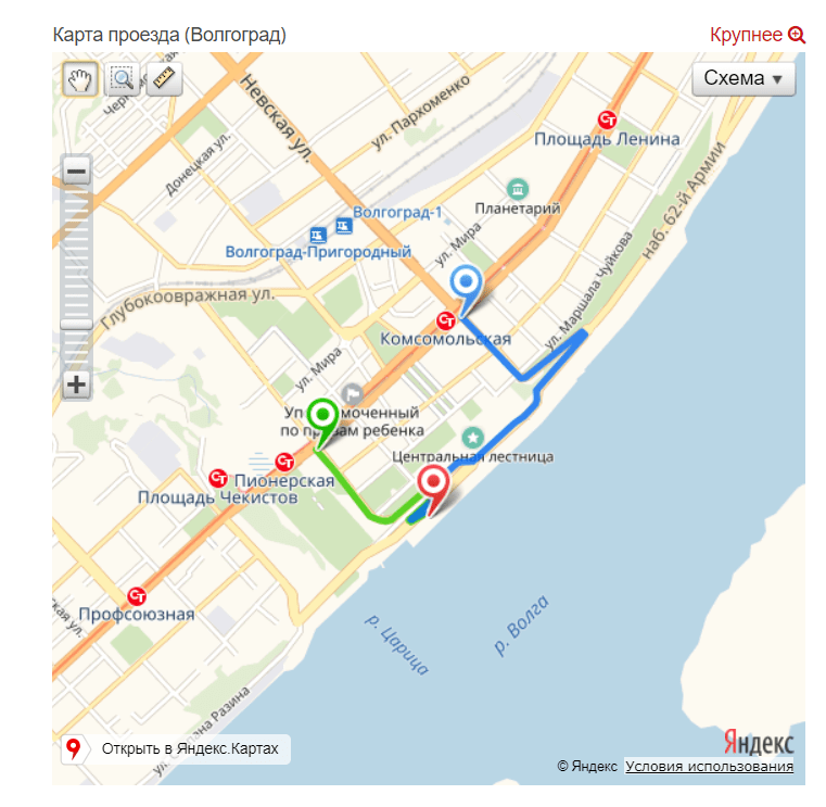
An example of the output of the location map using Yandex.Maps
-
Contacts of individual employees with a photo.
Showing real workers and their contacts, we kind of say to the visitor: “Look, we are real! We can be trusted and even ask questions in person. ” It is not necessary to indicate all employees, but at least the heads of the main departments / areas or sales managers.

Contact department managers
-
Company age .
Companies with proven experience cause more trust among visitors and this is logical. And even if the age of your organization is small, do not hide it from visitors, because it also causes suspicion.
To indicate the age of the company can:
-
Add start year and current to footer.

Years of work of the site
-
Specify the year of foundation in the header of the site.
-
Mark the main milestones in the section with the history of the company.
Key dates in company information
-
Bank details .
By specifying bank details, you confirm the "seriousness of their intentions." Place them not in a line or in abbreviated form, but in columns and completely (plus you can add a pdf file for download).
Ways to communicate with the store and company
It would seem that the obvious thing is that the visitor should be able to easily contact you. But there are still commercial resources that “diligently avoid contacting” with potential customers: they will hide the contacts, they will indicate the wrong phone number, etc. Let’s analyze how not to “hide” from our customers:
-
8–800 .
The free all-Russian number for the call makes you more accessible for communication, which means it reduces the likelihood of leaving your site for further search.
-
Several phone numbers .
Protect yourself from a situation where a potential client cannot reach you because of an idle or busy phone - give him a “spare” contact number (or set up multi-channel telephony).
-
Callback Order .
Not everyone can (and let's be frank, they want to) call you on their own. Let's take a step closer to such customers and give them the opportunity to request a call back.
Add the button "Request a call back" in the header of the site next to the phone company, thus it will be easy to find and it will always be "at hand."
We also recommend that you make a maximally minimalist application form (we remember that our client does not have time to fill it out) - there is enough contact field number, all other information can be obtained during a call.
It is important that the callback is really made (unfortunately, the opposite situation occurs very often; in order not to lose clients, we recommend to introduce CRM into the company's work). If the operator’s work time is limited by the work schedule, provide this information immediately. If the client sent a request during off-hours, let him know that he will be contacted with the start of a new working day.
-
Links to social networks .
Add links only to active profiles / groups. Otherwise, it is better to remove them completely, so as not to mislead potential customers.
Thus, the recommendation is the following: “Links to social networks are added, profiles are actively maintained.” Communicate in them with your potential customers: provide them with interesting and useful content, let's feedback. Be sure to fill profiles with relevant information (contacts, work hours, etc.). If you do not have enough time / other resources to work with social networks, contact us for the services of SMM.
Work with customers
What will happen if a visitor comes to the store, and there is no one there? There is no one to ask a question, no one to ask for a product to break through? With a probability of 99.99% (let's leave 0.01% for those who just “take a look at it”, he went) he will leave. Also with visits to online stores. Do not leave your potential buyer with the feeling that he is “here alone” - consider the following in the operation of your commercial site:
-
Customer Support Phone .
Pointing to the phone for customer support, you kind of say to all site visitors: “We don’t leave our customers after the transaction!”, I.e. affect their loyalty.
-
.Online consultant
Another assistant in a situation where the client has questions, but he does not have the ability (or desire) to call you, an online consultant can become.
It is important that the picture of the employee is real, and not from the photo bank (your visitors already have their eyes on the “faces of the employees” who wander from the site to the site).

"Stock" picture for employee photos
It is equally important to answer visitors' questions promptly. Display the online consultant window only during the employee’s work, so that visitors do not have negative experience when a question is asked and there is no answer.
-
Responsiveness to respond to a new order on the site .
If a person left an order and did not receive a callback, he will logically have a question: “Has my order been accepted at all? And is anyone involved with them? ”What is the probability that, without waiting for your feedback, he will go to your competitors? We think it is extremely high.
Do not let go of your customers so easily! While the flow of orders is small, do not be lazy to call back "manually", with a significant increase in volume, you can connect robots, sms-notifications, etc.
-
Email and sms confirming the order .
Also duplication of order confirmation by email and / or sms will have a positive effect on loyalty. Keep the client informed about what is happening with his order, report on status changes: “Accepted”, “In Processing”, “Sent”, “Delivered” and so on.
-
FAQ .
You can close a large share of the client’s fears and concerns by creating a section with frequently asked questions. Not sure what to place there? Chat with your customer service or customer service managers. They know for sure that most often excites customers. Also add to the page a form with feedback, in case the visitor did not find the answer to your question.
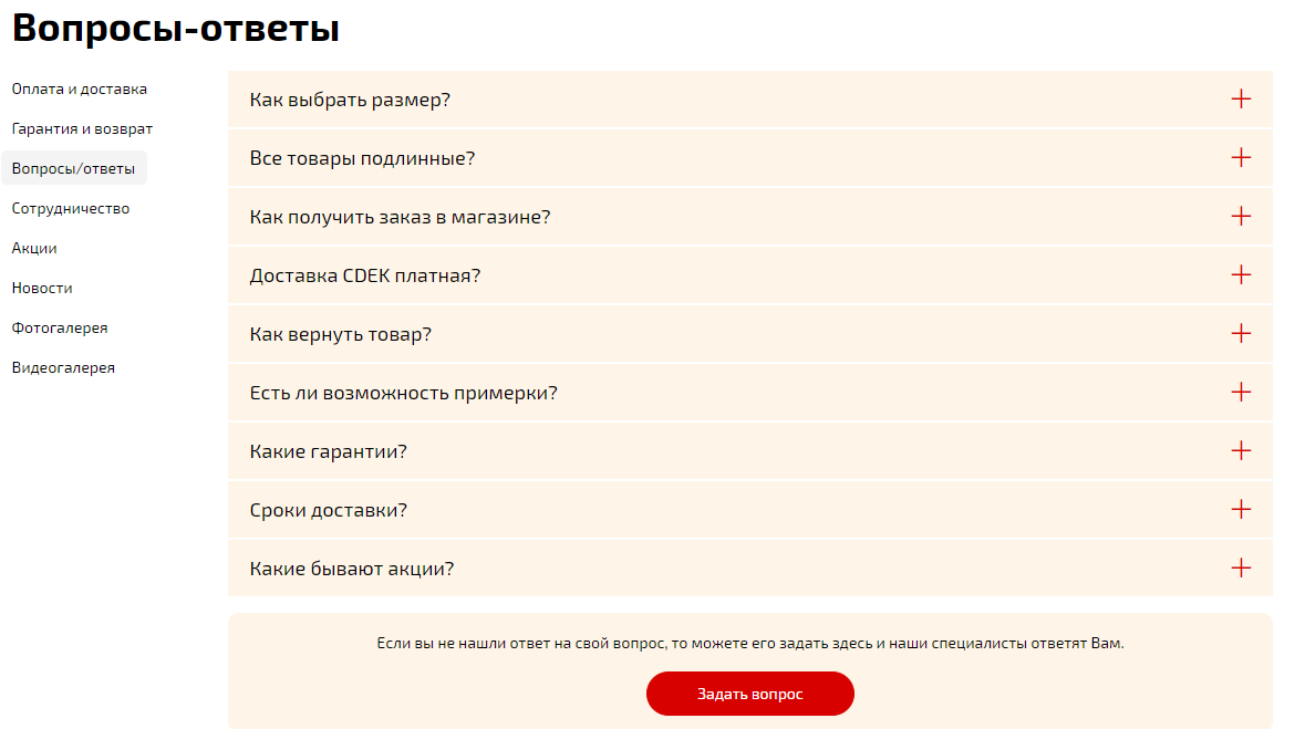
FAQ section and feedback form
Product catalog and product card
Imagine you come to the store, and there: half-empty dusty shelves, the goods are all hidden in the boxes / packaging so that you cannot touch / examine it, and to find out the price, you need to write an application on the information table. Well, how? Have a desire to buy? Rather, the desire to quickly leave! So that the visitors of your online store / website of services do not have such a thought, make sure that the directory contains:
-
A large number of product categories / services .
Well-designed structure significantly helps the site visitor to navigate. And this, of course, has a positive effect on user experience.
Convenient site structure
-
A large number of commodity items within the category / types of services .
A wide offer is an indicator that will additionally signal the PS about the possibility of meeting the visitor’s request on it.
-
Specifications / Service Description .
The more fully the goods / services on your site are described, the less additional questions a visitor will have, which means that he will have less reason to go to a third-party resource.
-
A unique photo, the opportunity to see the goods from different angles .
By adding unique photos to your site, you:
-
Increase visitor confidence.
-
Stand out from the competition, including in the search for pictures.
The variety of photos helps to consider the goods from different sides, to remove unnecessary questions and make a decision about buying.
Convenience of studying the goods with the help of photos
-
Price indication (discounts, bonus points).
Be sure to specify the value of the goods or services, at least in the format of "from". No need with the buyer in the secrets. If a calculator for calculating the cost is implemented on the page, output the result of the calculation immediately, do not force the client to fill in forms to receive it.
Instead of calculating the price, you need to fill out a form - this repels customers
Price "from" removes many questions from visitors
-
Information on stock and delivery .
If in the catalog you display goods that are not available, inform visitors about this in the product card. And be sure to give the opportunity to add it to your bookmarks / favorites and leave contacts to receive information about admission.
On the item card, the delivery information should be noticeable: how much will it cost, what kind of service, how fast. As a last resort, let's link to the “Shipping” section.
-
Cross-sell / Up-sell .
Try to close the “pain” of the client completely, even if he is unaware of its scale. For example, if he gets a tent, why not offer to add it with sleeping bags and a hanging flashlight.
-
Video review .
It's simple:
-
Video helps to better explore the product, or your competence in the service provided.
-
It delays the attention of visitors, thereby increasing the time spent on the site, which is in addition to the PF (behavioral factors).
-
3D model / overview .
Similar to video review, the volume model of the product has a positive effect on the user experience of your visitors.
-
User Reviews .
Product reviews are needed not only to confirm its quality, but also to remove a number of questions from a potential buyer: “Is this jacket suitable for slender people?”, “Are these shoes comfortable to wear with a wide leg?”, etc.
Product reviews
-
Comparison of goods / services .
The more features are available for comparison, the easier it will be for the buyer to choose.
It is important - only goods from the same category should be compared, i.e. one cannot compare, for example, shoes and jackets.
-
Product Popularity Rating .
Sometimes, a potential buyer needs a push to order, in the form of product approval by other people. And the best approval is to purchase it frequently. Give the visitor the opportunity to sort the goods by popularity rating, show which one is in special demand - make the same “push”.
Payment and delivery
It’s no problem finding an item of interest, paying for it and getting it with a minimum waste of time and energy - the experience of a perfect online purchase. The task of the resource is to help the user to get, if not the same experience, then as close as possible to him. What can help us in this:
-
Possibility to pay online .
Many buyers prefer to “pay and forget” about the order before receiving it. It will be a shame to lose customers (or rather, at a loss) due to the lack of online payment on the site..
-
Several payment methods .
Someone uses only credit / debit cards, for someone e-wallets are convenient (Yandex.Money, web-money, etc.), and someone trusts only cash payments. And all these people should be able to pay in a convenient way for them.
You can also help your potential customer and describe how to make the payment in the priority way for him. Thus, we will not only show our care for the visitor (and therefore, we will work a little on his loyalty), but also reduce by one point the probability of him leaving to search for the necessary information..
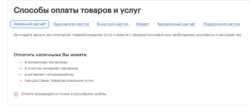
Several payment methods with detailed information about each
-
Possibility to buy on credit .
This item does not, of course, apply to any type of product or service. But if in your subject, purchases with the help of borrowed funds make up a significant part of transactions, then you should indicate this possibility on the site. And even better if the visitor immediately on the site will have the opportunity to calculate the loan and submit an application to your partner banks. Thus, you will completely close the client’s need, and he will not have to go to third-party resources.
-
Possibility to buy without registration.
It is necessary to get rid of any obstacles in the visitor's way of making a purchase. And the requirement to register before placing an order is just such a very strong obstacle. Why fill in a huge form on your site, confirm mail, etc., if you can do nothing of this and order on another?
To prevent this from happening, you can:
-
When placing an order, ask to enter an email address to which an account on your site will be automatically generated, and all the necessary data will be sent for further authorization.
-
Request only a phone number, and all the necessary data to receive from a subsequent call to the client.
-
Network of shops (points of shipment at own expense) .
The wider the representation of the company, the better - a greater number of buyers will be able to save on delivery and pick up an order from a convenient point on their own.
-
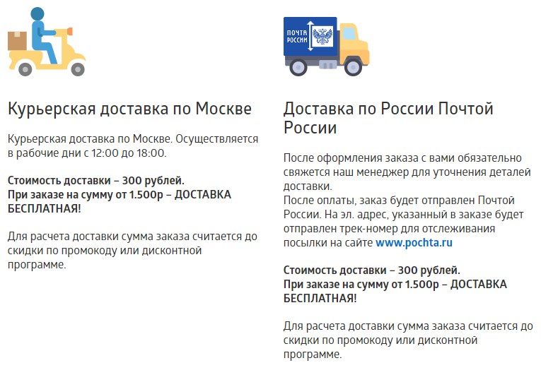
Adequate shipping cost .
Everything is obvious here - if the cost of your delivery is too high, your competitiveness is low. A good solution would be to include delivery in the total cost and indicate on the website that you are delivering orders for free.
-
The possibility of delivery to the regions .
Expanding the geography of delivery, you expand the reach of potential customers. Now a great many transport companies, and about the "Post of Russia" do not forget. Send an order to anywhere in our country will not be difficult. Do not miss such an easy opportunity to receive an additional order..
The possibility of delivery to the regions
-
Prompt delivery .
Often, the customer needs the goods already “yesterday”. Therefore, fast delivery can be your competitive advantage.
-
Delivery Calculator .
Marketing tools
All people love gifts and prizes, and more! Make your customer happy, give him some kind of bonus, discount, etc.
-
Promotions and special offers .
It is important that the conditions of participation were as simple and transparent as possible. A one-time discount of 3% for 5 friends who completed 10 orders in a week is unlikely to interest anyone greatly.
-
Sell-off .
Seasonal or dedicated to some holidays sales in one form or another should be, because they are almost certainly have your competitors. And if not, then you have a great opportunity to gain an advantage.
-
Separate sections on the website for shares (sell-off, special offers).
Here it is important that sections contain only relevant information. If you are not holding any promotions now, you can always make a "permanent" in the format "Get a coupon for a discount for a review." Thereby you do not leave clients without bonuses and fill the site with reviews, i.e., again, you influence commercial factors of promotion.
Section "About Company"
Very important point. He is not just "About the company", he is about trust! You! The more a potential client can find out about you from you, the more trust you will have and the less need to go looking for information somewhere on the side (and there the competitors could write their reviews).
-
History.
Tell your customers about how your company appeared and developed. What are the stages of formation passed? Thereby you once again convince them that you are real and you can be trusted.
-
Certificates, awards, certificates.
The presence of documents confirming the competence, as well as the professionalism of the company, has an extremely positive effect on customer loyalty.
Praise yourself!
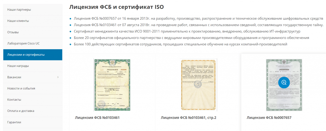
Section with licenses and certificates
-
Mission.
Not to be confused with the description of the company. Here you need to talk about what is the meaning of the work of your company (except for profit). What principles / values do you adhere to in your work?
-
Vacancies.
Even if there are no current vacancies, write that you will welcome new employees. His candidacy will be considered first. Specify the hr-specialist mail and / or add a form to send a resume.
-
Office photo .
It is important to add not only the photo "from the street", but also inside. Show that you really exist and work.
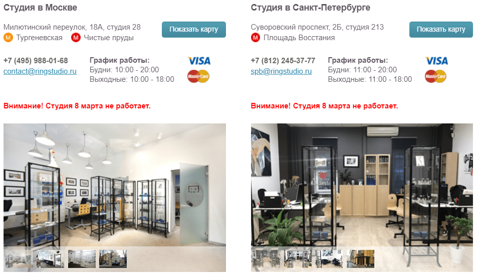
Studio photos
Optimization
In addition to commercial factors, the influence of which on the ranking of your site is obvious, there are seemingly completely irrelevant factors with a “technical” hue:
-
Domain readability .
When inventing a domain name for a site, try to make it as simple as possible for memorization and playback. Do you think it would be convenient to recommend the site 2321specmecstr-ug.ru? “I bought this drill at twenty-three, twenty-one specials metz str yug,” sounds, doesn’t it?
-
Readable site URLs .
URL on the site should be in the form of CNC.

Successful use of CNC in the address
-
Absence of multiple keyword entries in the URL .
Yes, with this, be careful not to let out the re-spam.
-
Readable Site Title, No Repeat Keys .
Although the title affects the ranking, do not write it exclusively for the search engine, trying to enter all the keys in it. Think of it primarily for people, but consider statistics.
-
Consistency of title and page content .
If the content of the page is not relevant to the search query content, you will not solve the client’s problem, which means it will leave you. And the more often this happens, the worse your commercial resource will be ranked.
Navigation
Imagine you went to the store, and the entire shopping assortment in it is piled into one big pile. And to find the product you need, you need to search through this whole bunch. And there are no guarantees that you will eventually find.
So that a visitor to your site does not feel like a buyer in such a store, consider the following factors when designing a commercial site:
-
The rule of "3 clicks" in the design of the site structure .
The fewer clicks you need to make to go to any page of the site, the better - ideally not more than 3. Otherwise, the visitor may leave your site, desperate to find something on it.
-
No unnecessary categories.
Do not complicate the site navigation with unnecessary sections.
-
Filters and sorting for quick search of goods / services .
Conversely, you can simplify site navigation with filters and sorts. But the easier it is for a visitor to find the desired product / service on your website, the more likely it is that he will leave your order with you.
-
Site search
The absence of a working search on the site may have a very negative effect on its navigation component.
-
The lack of advertising of third-party resources on the site .
First, you will simply give away your customers to others.
Secondly, the search engine can take you not as a commercial, but as an information resource, which with the help of the catalog wants to attract visitors. As a result, you can be greatly reduced in the search results.
Additional factors
These are rather not commercial factors, but auxiliary ones, by which you can indirectly determine whether your resource is convenient for visitors, whether they find a solution to their problem on it. To do this, you need an analytics system, for example, Yandex.Metrica. What can be seen with its help:
-
The percentage of failures of both the entire resource and individual pages . If on some pages this indicator noticeably stands out from the general trend or has changed dramatically, it is worth checking out. Perhaps the page does not solve the problems of users badly, or some element appeared on it that dramatically worsened the convenience of its use.
Similarly, you can analyze this indicator for various technological parameters of your audience:
-
The type of device.
-
Display resolutions
-
Browser, etc..
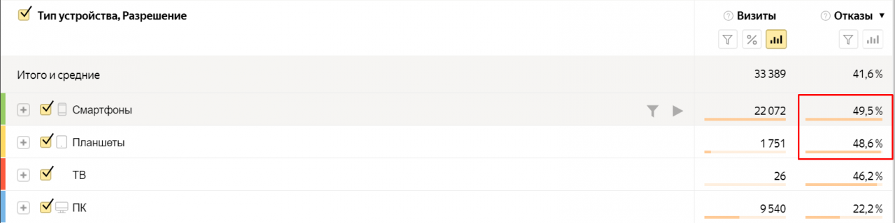
A large number of failures on individual devices - a reason for detailed study
-
Brand to non-brand search traffic . If the majority of visitors come to you by brand inquiries, it means that the pages of your catalog are poorly ranked by search engines. They should be analyzed to make adjustments to the promotion.
Check list (pivot table)
For ease of use, the recommendations we have brought them into a single table. Use!
Download ChecklistParsing product card (video)
We also recommend watching the video of our senior SEO-specialist Alexander Kizima, in which the influence of the quality of the product card on the conversion of the site is considered in detail.
Findings
As you can see, there are many commercial factors, but in the end they all boil down to one thing - the site should sell well. If you feel that there are problems with this, but there is no time to find out the reasons, contact us for an audit of commercial factors. We have extensive experience in the analysis of online stores and websites of companies.
This article was translated automatically. We are working over improving the translation.
Please send your questions about the article to info@intervolga.ru
- 26.08.2019
-
Ekaterina Bogachenkova